Laatch landing page
Landing page for Laatch, a night-time support app for new parents.
- Landing page
- Web
- UI
How Laatch works
A 65-second motion graphics explainer: the 3am problem first, then how the app answers it with the AI companion, Latch Check, Med Checker, feed logs and the Night Owls community.
The brief
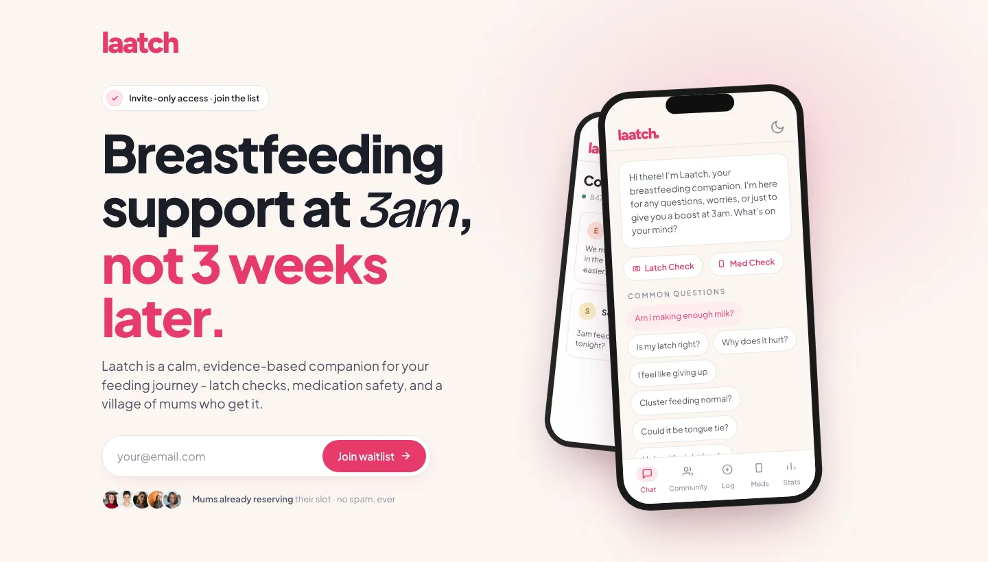
Laatch is a breastfeeding companion for new parents, built for the hours when help is hardest to find. The landing page had one job before launch: get the right parents onto the waitlist.
The audience is tired, anxious and reading on a phone in the dark. Every decision came back to that: short copy, calm colour, and one clear action.
Showing the whole app at a glance
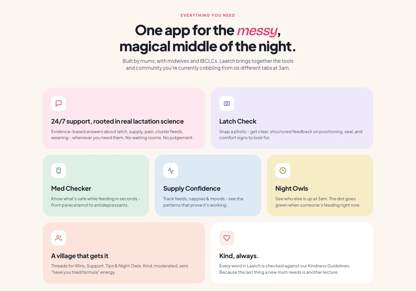
Laatch does a lot: AI support, latch feedback from a photo, a medicine checker, feed tracking and a community. Listing it all as equal bullets would overwhelm someone at 3am.
A bento grid gives each feature its own soft colour and a one-line promise. The two features parents ask about most get the larger tiles, and the rest can be scanned in seconds.
Building trust in the AI
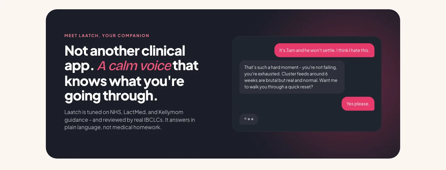
Parents are rightly wary of health advice from a chatbot. This section shows a real exchange instead of describing one, so the tone does the convincing: warm, plain and reassuring.
Below it, the sources are named (NHS, LactMed and Kellymom) along with review by lactation consultants, so the claim of being evidence-based is something parents can check.
One action, repeated
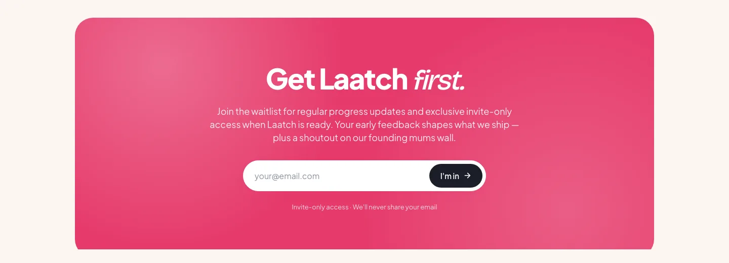
The page asks for one thing, an email address, at the top and again at the bottom. No pricing, no app store links, no competing calls to action.
The closing block frames the waitlist as early access with a say in what gets built, which suits a product that's still taking shape.