Rebuilding the Joules mobile checkout
Cutting drop-off in a three-step mobile checkout, where small frictions were quietly costing five figures a week.
- Checkout
- Mobile
- Conversion
Focus
Mobile checkout drop-off was the largest single revenue leak in the funnel. Address entry, payment selection, and error recovery were all suspect, but no single cause was obvious.
Constraints
- Magento backend with limited form-field flexibility
- Existing payment gateway contract: no swap allowed
- Trading freeze through November to mid-January
- Brand voice and tone had to remain warm, not transactional
Context
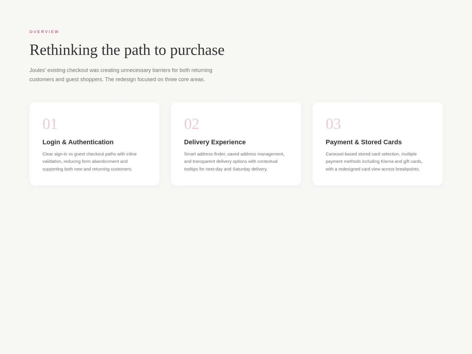
Joules is a UK lifestyle brand (wellies, prints, the occasional dog jumper) with a customer base that skews older and more mobile than the team often assumed. When I joined the project, mobile traffic was already sitting north of seventy percent, but mobile conversion was lagging desktop by a margin too wide to be incidental. Drop-off in checkout, specifically, was the largest single leak in the funnel.
I was brought in to lead a focused twelve-week stream: figure out what was actually going wrong, design something better, and ship it before the trading team locked the codebase for the winter peak.
Approach
I started with the boring, useful work first. Pulling six months of session recordings, funnel reports, and customer service tickets, then sitting in on five remote interviews with people who had abandoned a basket in the previous fortnight. I wanted the qualitative texture (the sighs, the second-guessing) alongside the numbers.
A few patterns surfaced fast. Address entry was a slog: postcode lookup existed but the field order felt wrong on a phone keyboard, and the manual fallback was buried. Payment selection looked simple but the radio buttons changed the form below them in a way that was disorienting. And errors (God, the errors) were stacking at the top of the page, far away from the field that had failed, often after a full page reload.
Decisions
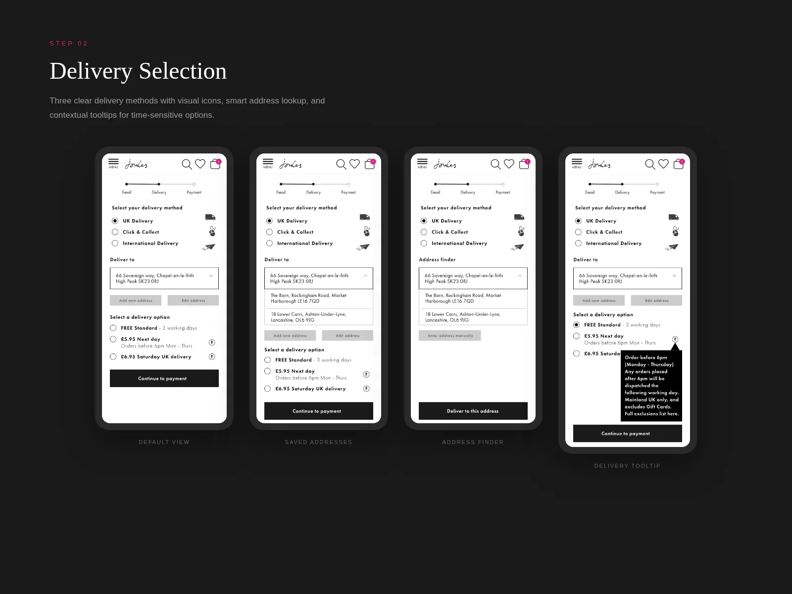
Three decisions defined the redesign.
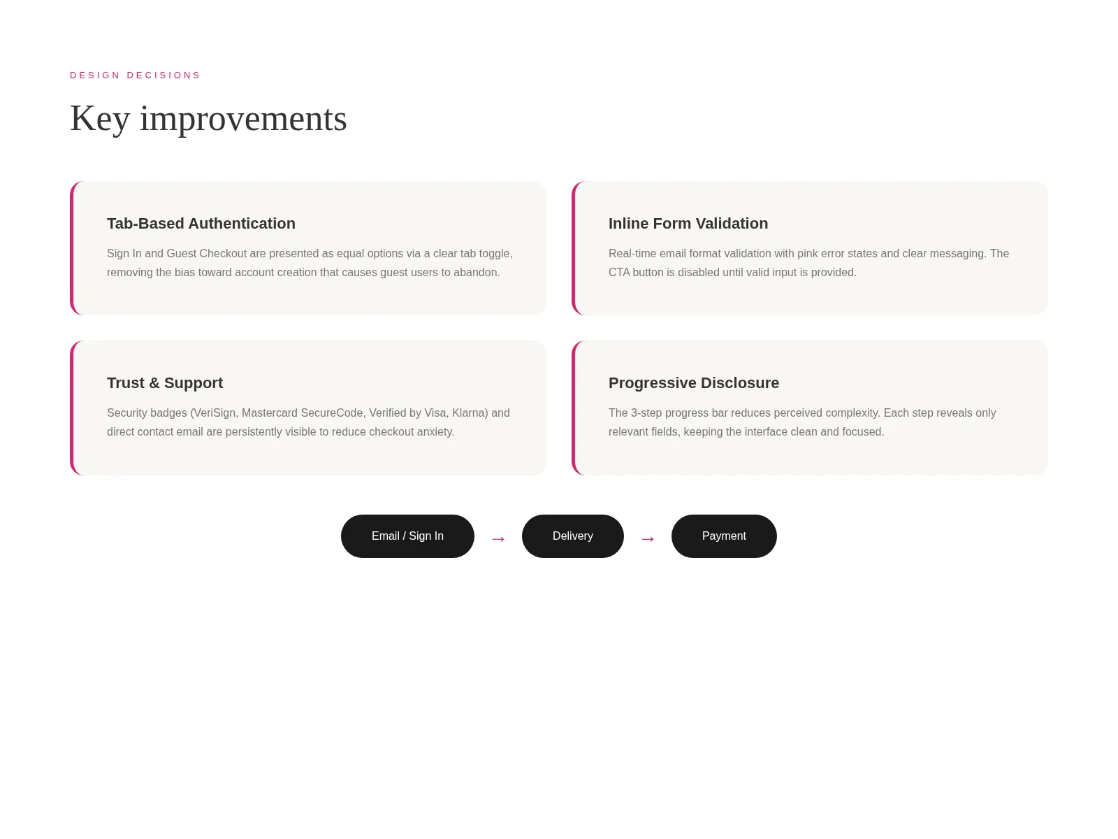
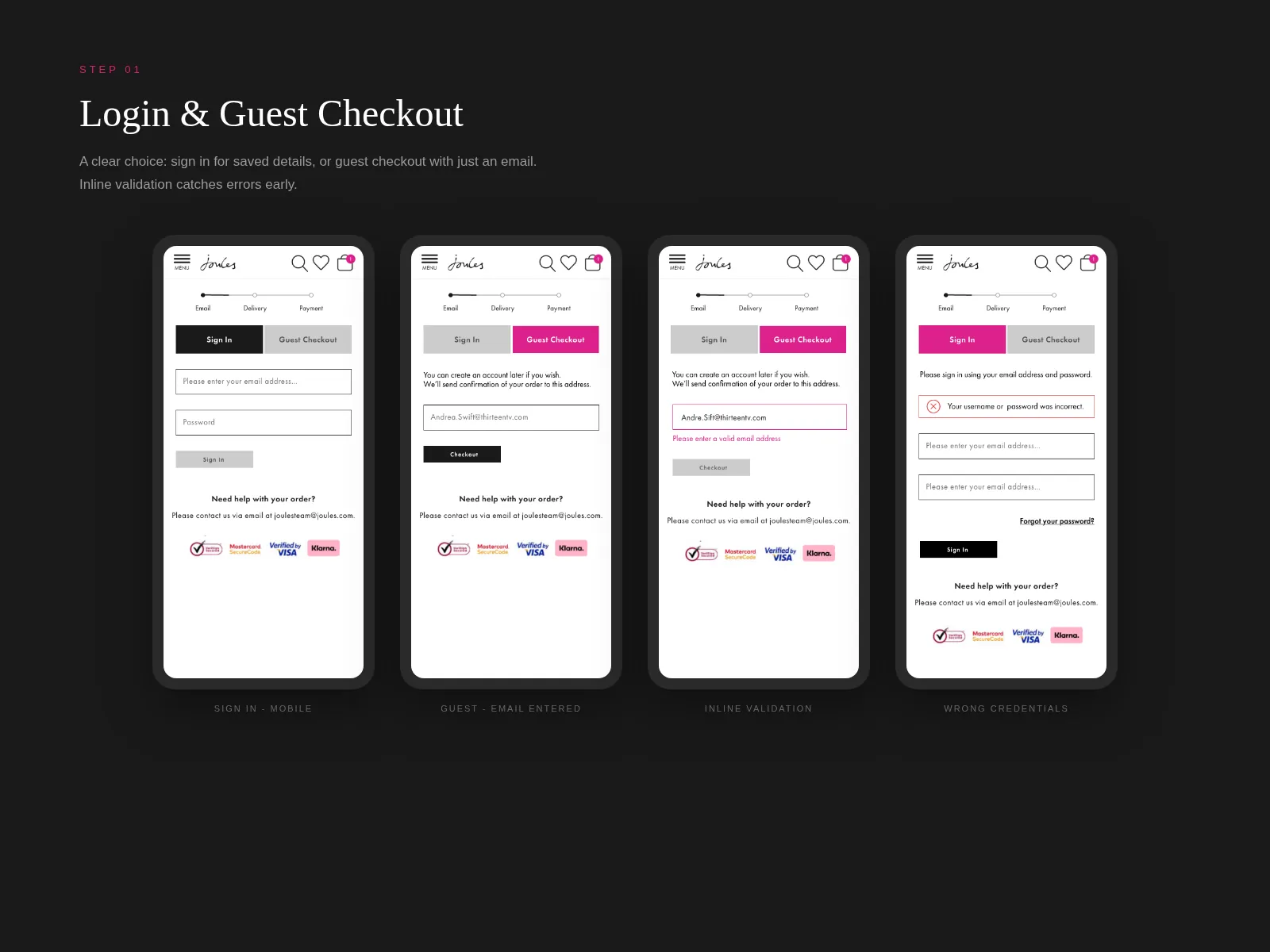
First, I argued for keeping the three-step structure rather than collapsing to a single page. The team had been considering a one-page checkout because it tested well in industry write-ups, but our analytics told a different story: people were not bouncing because of step count, they were bouncing because each step felt unsteady. I wanted to fix the steps, not fight them.
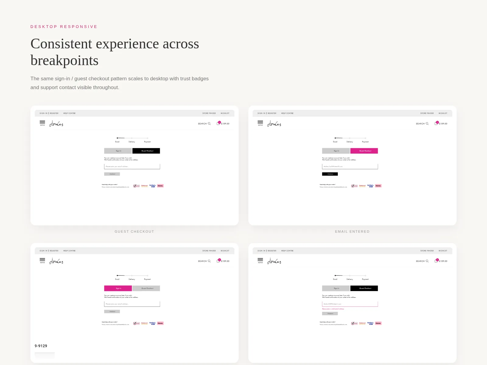
Second, I committed early to guest checkout being the visual default, with account creation offered after payment as an optional, no-friction add. The merchandising lead initially pushed back (accounts drive lifetime value), but I showed the data on guest-to-account conversion at the post-purchase confirmation point, and we agreed it was a stronger long game.
Third, errors moved to the field. Inline, polite, and never on submit alone. We validated on blur, reserved space for the message so the layout did not jump, and wrote the copy in plain English (“We need a postcode to find your address” rather than “Field is required”).
Iterations
The address step took the most rounds. I went through four versions before landing on a layout that placed a single autocomplete input at the top, with a quietly visible “Enter manually” link beneath it. Earlier versions hid manual entry behind a click; testing with five participants in a low-fi prototype showed two people had no idea it existed. The fix was unglamorous (show the link, always), but it shifted completion in moderated tests immediately.
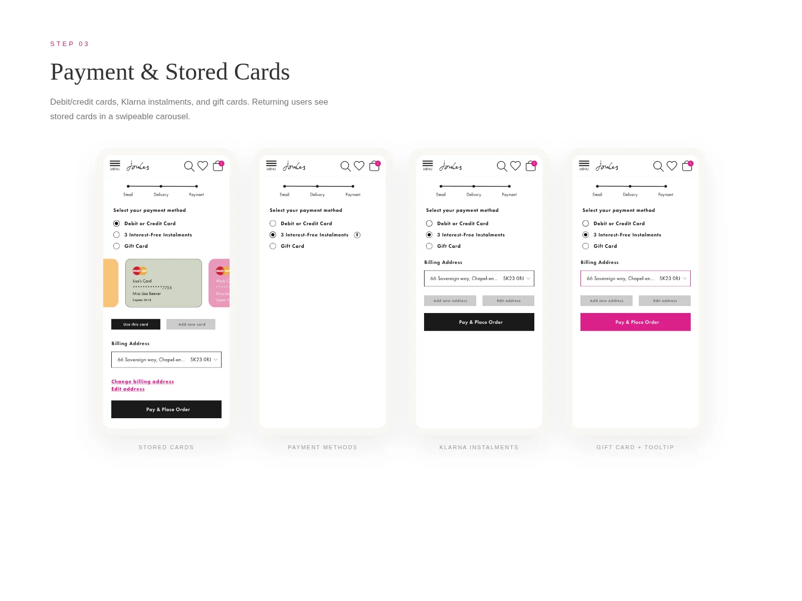
Payment selection went through a smaller but meaningful change. The original radio-and-form pattern was replaced with a stacked option list where each method expanded in place when chosen, with a clear visual seam between selected and unselected. Engineers liked it because it simplified the state model. I liked it because it stopped the page from feeling like it was being rewritten under the user’s thumb.
Collaboration
This was a tight team and I tried to design out in the open with them. Engineers got involved early. I shared a Figma file with annotated states before I had finished polishing, because the back-end constraints around what Magento could and could not do at the field level were going to shape every decision. The lead engineer flagged two interactions I was sketching that would have required a non-trivial backend change, and we found cheaper alternatives in an afternoon together.
The PM and I ran a weekly twenty-minute “what’s slipping” call rather than a longer status meeting, which kept the team honest without burning their day. The researcher ran a five-person moderated round mid-build that caught a colour-contrast issue on the disabled state of the pay button, a small fix that mattered.
Outcomes
We ran a 50/50 split for three weeks before rolling out fully.
More qualitatively: customer service tickets tagged “checkout” dropped noticeably in the four weeks after launch, and the merchandising team stopped flagging checkout as a top three concern in their weekly review.
What I’d do differently
I would have run a low-fidelity mobile prototype with real customers in week two, not week six. We did the right tests, but later than I wanted, and a couple of the address-step iterations could have been collapsed if I had bought myself the data sooner. I would also have written more explicit acceptance criteria around the empty and error states from the start. They were the most-iterated pieces of the build and would have benefitted from a clearer brief.
Impact
A redesigned three-step mobile checkout with address autocomplete, persistent guest checkout, inline validation, and rebuilt payment selection. Shipped behind a 50/50 split test before full rollout.